
This time of year, television networks will play Rudolph The Red Nosed Reindeer, the herky-jerky stop motion animated movie from 1964. In this adaptation of the old story, Rudolph features a nose that illuminates with an incandescent bulb and makes a horrible sound like microphone infinite loop feedback. At one point, the title character famously ends up on something called The Island of Misfit Toys, where unsellable items like a polka-dotted elephant and a train with a square wheeled caboose find camaraderie.

source: geekdad
In many ways, American Motors was similar to this mystical island. While perhaps better known by later products such as the Gremlin and Pacer, the company was created by mergers of firms that made rather odd, out-of-the-box products such as Hudson, Willys, Kaiser-Jeep, and Nash. All of these were small companies that dared to explore markets that the Big Three had little interest in at the time (and in many cases would prove to be decades ahead of their time), and American Motors kept up this trend until their 1987 demise. In this installment of AMC What If?, we’ll look at a segment that they had delved into once but never revisited.
One of the products made by AMC’s Nash brand was an adorable British built little compact car called the Metropolitan. Introduced in 1953, this compact two seater convertible (or hardtop) was introduced at a time when bigger was better in American cars, but there was still a small segment of the population that didn’t agree with that thinking. The Metropolitan was never a mega-seller but found enthusiastic buyers nonetheless when new and even today. In fact, if you visited the LA Auto Show you saw a relatively new fan of the marque had proudly dumped his forlorn example on the convention hall floor for all to see.

American Motors didn’t replace the Metropolitan when it disappeared after 1962, and with quarter-a-gallon gas few explored this idea of an entertaining economy ultra-compact in the years that followed. The fuel crises of the seventies forced manufacturers to consider this formula again, yet some of the ‘commuter’ cars that ostensibly resulted in the early eighties (like the Pontiac Fiero and Honda CRX) were really just a ruse to make sports cars, and none were ragtops.
What about an alternate reality where American Motors brought the Metropolitan back to life around late 1984? As Volkswagen proved later with the New Beetle, tapping into the nostalgia can be a ticket to success. Still, in all honesty the revived VW didn’t really offer anything substantive that the concurrent Golf did not. With the reborn Metropolitan, AMC would do more than just lure in buyers with cuteness; they’d attempt to recreate the fun commuter car that the original was, and the market might have been interested in again.
The mechanicals for the new Metro? In the early eighties, AMC was partnered with Renault (who was not really a misfit, just French) and selling the R5, one of their amusing subcompact hatchbacks which they had whimsically called the Le Car (left below).

However, when Renault released the redesigned ‘Supercinq’ in 1984 (right above), AMC ceased importing the model to the United States, instead giving us the far less interesting Renault 11-based Encore hatchback. As luck would have it, the ‘Supercinq’ measures within inches of the OG Metropolitan, and like the original Metro the Renault offers the perfect blend of economy, supple ride, decent (for the time) performance and reasonable handling (and a turbocharged model). Other than a slight wheelbase change, these mechanicals could be perfect as-is in the new Metro. It would NOT be a sports car, but if you’ve ever seen footage of Renault Cup racing with R5s battling it out on three wheels it should be obvious that any perceived lack of fun with this chassis is your own problem, not the car’s.

source: wikimedia
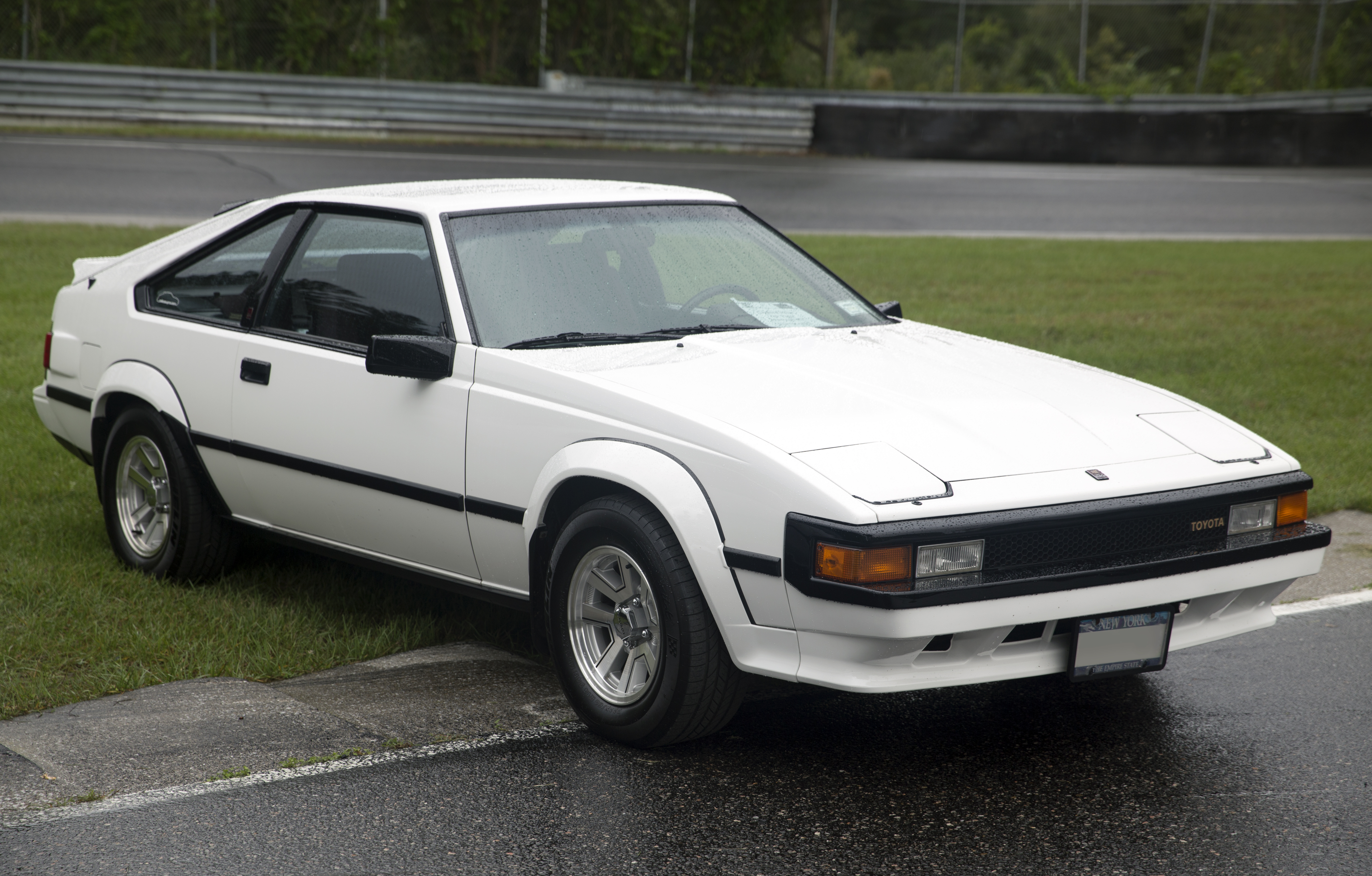
The overall design and style of the new Metropolitan would be retro from an eighties standpoint instead of the nineties/early 2000s perspective of the reimagined T-Bird, Beetle, and Mustang. As such, you get a more angular interpretation of the Metropolitan. A good real-life example of a malaise nostalgia nod might be how Toyota did subtle visual shout-outs to the legendary 2000GT on the becoming-legendary folded-paper 1982-86 Supra (God, I forgot how much I love the looks of BOTH of these):

sources: Streetside Classics , Bring A Trailer and wikimedia
The 1985 Metropolitan would still get the signature cuts in the door tops, the triangular shape of the rear window on the convertible and the add-on hardtop, inset grille, and skirted wheel openings. Admittedly, the tops of the wheel openings at the front might need to have cut lines to allow them to pivot out for low speed tight turns, but cutting a bigger opening kills the Metro look completely (I tried it). The 1984 Lincoln Mark VII was the first US car to get composite lights, so the Metro could legally have them as well.

The alloy wheels and tires shown would be available on the Turbo version. Steelies would be on the normally aspirated 65 horsepower car:

At the back, there’s no separate spare as on the original car, but there is a wheel shape on the trunk lid to echo that feature. I debated this one (too Lincoln/Superfly) but without it just lost that Metropolitan feel. However, unlike the tire shape on the back of a Lincoln coupe there’s really a space saver spare tire behind there (yes, I know that the Renault 5 we got here had the tire on the engine, but the later Supercinq did not). It’s a pretty high liftover but you could get fitted bags shaped and designed to look like your car, because I hadn’t gotten vomit-level cute with this thing yet.

If you’ve never seen an original Metro, you would just see it as a funky looking fun car. The car actually ends up looking a bit like an earlier, lower Suzuki X-90, or more surprisingly like the squatty, squared-off cars that the cubic people drove in the Playskool McDonalds playset us Gen Xers had as kids:

sources: ebay, etsy, and Pinterest
However, there was a request from the new Metropolitan owner on staff at the Autopian to make a more lurid two-tone version with the hardtop in place, just like the original car offered.

source: Barrett Jackson
I had been avoiding this since I knew that while such a treatment looked good on the original in a fifties drive-in/sock-hop kind of way, on this tribute version it would likely be… a bit much. I was right – see below. It looks like a FILA sweatsuit, which is admittedly very period over-the-top (and would likely sell). I did try doing the zig-zag thing on the fifties version above but it just went too far (but I’ll give it a styling reference inside- you’ll see).

You could get those aforementioned alloys, but with this paint scheme they would be in a lighter ‘Ice Ice Baby‘ white-mica finish. Nash made prototypes of a wagon version of the Metropolitan back in the day, and it might have been possible to predate the Pulsar NX and offer a wagon-style full length ‘shooting brake’ hardtop for the car with a rear hatch to replace the trunk lid:

The interior has some odd features as you might expect. Essentially all of the gauges and controls are on a pod in front of the driver. The lights and climate controls stick out of the instrument binnacle like some kid’s robot toy. Note also that the door panels feature that ‘zig zag’ form that was seen optionally on the sides of original Metropolitans. The alarm clock on the dash rotates to face either driver or passenger, and recharges when in place so you can take it with you into a hotel, your home, or wear around your neck. Yeah, Boi!!!!

In back, the package shelf (like the original) would have worthless seats with the primary purpose of telling insurance agents and unconvinced spouses that the car is not a two-seater even though it really is. These seats would aim inwards slightly to push the legs of unfortunate occupants to the center. This ‘club seating’ arrangement was actually done on a Nash coupe back in the fifties:

source: JalopyJournal
The goofy-but-useful character of the original Metropolitan might have translated well into the Malaise world filled, bridging the gap between dull hatchbacks and ‘sports’ cars. Like all of the objects on The Island of Misfit Toys, they might not have been big sellers but they’d certainly have found someone to love them.
1985 AMC Metropolitan Turbo
Base Price: $7.850
As Shown: $9,520
Options Shown on Photo Car:
Air Conditioning
Convenience Pack (power windows, locks, and mirrors)
Cruise Control
Gordini alloy wheels
Cassette player
Metallic paint
Drivetrain:
1600cc OHV 4 cylinder, turbocharged 98HP
5 speed manual transaxle
Chassis:
Double wishbone independent front suspension- torsion bars
Trailing arm independent rear suspension- torsion bars
Front disc/rear drum
Rack and pinion steering
Performance:
0-60: 8.8 seconds
Top speed: 118MPH
All illustrations by The Bishop

- Someone Gave Me A Free Nash Metropolitan In Los Angeles, So I Guess I Have To Move There Now (Updated) – The Autopian
- A Man Spent Decades Becoming A World Expert On Nash Metropolitans. Then He Put All His Parts Inside His Car And Gave It To Me. Here’s A Look Inside – The Autopian
- A Daydreaming Designer Imagines An AMC Sports Car Based On The Look Of The Pacer – The Autopian
Want to write for The Autopian? Pitch us here. Or check out the stories on our homepage.
Okay i don’t know who needs to see this but i had a mighty urge to show this to the many Nash fans on this site
https://www.classicautomall.com/vehicles/4920/1961-nash-metropolitan-couch
The grey-blue convertible with alloy wheels (the “turbo” version) actually resembles the Geo Metro convertible quite a bit. That is a good thing. (I have a ’91 that’s undergoing a bit of a restoration and will be painted Mazda red, although the grey-blue does look very good!)
That works surprisingly well.
Can it drive chopped in half like a Renault 11 though?
I’ll keep it short and sweet: with the steeled it looks really neat – a true update; with the alloys it’s just another hot hatch and not in any unique like the original.
Tommi- ideally it needs color-coded steelies and baby moon-shaped caps. That would have been the play. You could even get whitewalls back then in this tire size pretty easily. Still, I actually DID want one version of this to be a ‘hot hatch without the hatch’ where the ‘Metroness’ is downplayed and this would have been just a way to get the R5 convertible onto our shores.
$7850?
Base Mustang LX sold for $6880 and the GT $9885
This would not be selling like Hotcakes
martahag- base mustang LX was not a convertible. The GT ‘Stang you quote likely had no options. But yes, I think this thing likely would not have been dirt cheap and likely would not have been a hot seller.
I cannot sleep until I say this: Bishop, you did a great design with this one! This is a perfect rendition for the era you specified. I’m not a Metro fan but this is a perfect evolution.
Thank you for making this.
Saddle Tramp- glad you like it! As I said before, I’m not a MetroHead either but not every buyer is me. If it was a way to get a Turbo R5 into the country, all the better!
The ’80s were real heavy on the 1950s decade nostalgia, to the point that its kind of weird that the only retro designs we got were the 1920s & 30s-style neoclassic conversions from the aftermarket, which was a fad that hung over from the ’70s. If AMC had done this, it might well have moved the timeline up by 15 years and sparked a retro craze in the mid ’80s instead of the late ’90s/early ’00s.
…cut to David Tracy climbing through a pick-and-pull to retrieve a “holy grail” ‘85 Metropolitan alarm clock.
I’m down for a funkier Renault Supercinq !
We need to make sure it has the uniq 3 lug wheels too!
Justin- sadly, the later Supercinq had boring-ass four bolt wheels in addition to no tire on the engine. Pity.
Anyone who thinks Renault 5s are funky and fun has not spent enough time trying to access their clutch cable.
Every time I see something Metropolitan related, I want one more and more and more.
My sick mind has even thought about doing an economy build with one.
GAWD I hate my brain sometimes!
You clearly have too much time on your hands and smoked too much weed.
It actually does already exist.
https://www.erclassics.com/ebs-renault-super5-cabriolet-1990-e6181/
Darkbrador- yup, that’s that car I used as the basis (same as the one that came out for 1985). Mechanically just Photoshop shortened the wheelbase slightly in back. So you can see this car would have been more than doable.
Eoghan- wrong on both counts:
– Magic Marker fumes
-I do not have time on my hands; just using time that I am supposed to be doing something else, like my job and doing stuff with my family.
Congrats dear Bishop, you’ve just designed the supercing EBS and the supercinq Belle-Île. 😉
Please never stop making these!
They kind of make me angry that he wasn’t around, and in a senior management capacity, at American Motors back then. I really want to see an old clip of this Metropolitan parked in MotorWeek’s studio with John Davis saying something to the effect of “when it comes to clothing, they often say fashions are cyclical, but does that notion extend to cars as well? When it comes to their latest front drive import, American Motors is hoping the answer is yes”
Ranwhenparked- I’d like that too! Especially the part where they do the road testing and show the 60MPH-0MPH braking test, and in pre-ABS days you’d get a squealing, smoking tire mess.
And the interior noise measurement on the highway – we recorded 71 dB at a steady 55, not bad for a convertible
The front styling has a definite Austin Metro feeling and the original Metropolitan was made by Austin so would a BL platform work? I’m thinking of a Maestro styled like a Pacer.
One could make a case that the Renault Alliance convertible was the actual successor to the Metropolitan.
Whoa, Slow Joe! It’s one thing using a 1980s Renault platform, but underpinning this thing with a British Leyland chassis would be going from a toaster oven on ‘warm’ right into the inferno.
That’s a very handsome design. I wasn’t sure about the spare tire shape on the back at first, but after thinking about it a bit, it gives the car some unique character. The angled-in “club” seating in the back would be a fun icebreaker for a flirtatious pair where each one is afraid to make the first move. I’m not so sure about the “hat” that the car is wearing with the hardtop, but convertibles always look better with the roof off.
Here is the ’80’s Metropolitan. It is even two-toned.
https://youtu.be/Oeo5MAOpkIM?t=9
(no endorsement of the dealer or financing, the image was just too perfect to bother looking for a non-sales video)
I like this one a lot. Doesn’t look quite as stubby as the original Fiesta-is that partly the cut-line front fenders? The call out to the cut-down doors really sets it off. I’d like the shooting brake-of course-but with the steelies.
I even like the interior. Robot alarm clock is funky, maybe even tacky, and cool. The lighting and hvac controls remind me of my 80s Subarus: the early EA81 cars (rounded fenders) had little ‘horns’ sticking out from the gauge area at an angle. My lights were a couple inches from my right hand-handy for sudden deer intrusions.
This ticks a bunch of the right boxes for me: covet.
Thanks for sharing it!
My Chevy Beretta did the same thing with the controls…the gauge pod had two rotary ears on either side for the lights and the wipers. One was orange, the other blue.
Odd at first, but I did get used to it. The only stalk was the turn signal (and it was literally a plain level).
FC RX-7’s also had that design for controls.
Sometimes there are things that didn’t happen and then you think “Good. It’s good that didn’t happen.”
JRW- hey, I wasn’t designing this for myself. To be honest, it’s not really my kind of car either.
Give ME ten grand in 1985? Look at the images in my post. You just know I’m headed to the Toyota dealer for a used 1982-83 Supra P-type in black with that purplish-grey leather and a 5 speed. It would probably still be running and I’d still be driving it today.
It just goes to show you how, given the whole bunch of constraints a designer simply must work within, how relatively rarely the final package can be made into magic. As I’ve said elsewhere here, I think many of the cars I love from decades past are simply unsurvivable on American roads now, but I do sort of miss the days when a car could be anything a manufacturer could figure out how to stamp.
When I was in college we got flown to California so that our football team could play in the Rose Bowl and they set up a bunch of car rental deals for us. So they let 20 year-olds rent Supra Mk IIs. In California, for a party weekend. I don’t know what they were thinking, but the 25 age limits for rentals you see now are probably our fault.
Also, Clarice was hot.
JRW- Clarice was, but why was that girl in the Land of the Misfits? She seemed normal and I forgot if she had some kind of sad back story?
Believe it or not, that’s actually a question that has been asked again and again:
https://en.wikipedia.org/wiki/Rudolph_the_Red-Nosed_Reindeer_(TV_special)#Dolly_for_Sue_mystery
And now I’m down a Google hole.
https://www.distractify.com/p/why-is-the-doll-a-misfit-toy-rudolph
JRW- also, what’s wrong with a polka dot spotted elephant? Grey is just so dull for a toy.
It’s my favourite Supra as well. Mmmmm-hmmm.
Food for thought:
1. Cute design means chick car you lose a lot of sales. If you think the female market is big enough it is not a bad idea.
2. Italian cars are considered sporty and sexy, using an Italianesque name promotes that image onto the car. French cars are considered weird and quirky, using French like names conatates that image. That you dont want. For example The Car? I know the French love Jerry Lewis but he aint selling cars.
3. Lets remember 25 cents a gallon was not really cheap when minimum wage was like $1 an hour, most companies didnt pay time and a half, and a mortgage on a nice house was about $115, ands great new cars sold for less than $3,000.
4. IMHO the smaller the car the less you can be creative in the paint scheme. Doing just a blue bottom white top would look better than trying to oreo cookie it. But the checkerboard Partridge family bus looks cool.
5. Column idea iconic vehicles where are the originals now?
6. One car cant be a fit for everyone. And stuffing it with gimmicks was that eras example similar to todays EVs cramming everyting like screens to open glove boxes.
7. In an era when small cars were extremely cheaper and gas was not super expensive why use underpowered engines trying to pinch a few pennies? Can you imagine if they decided not to cheap out on power and performance? Like the Miata, not super fast but not a toy either? Then a small for the day family 4 seater? A mustang before its time?
8. I believe except for very low production numbers, with very high sale prices you can only go niche so far.
“1. Cute design means chick car you lose a lot of sales. If you think the female market is big enough it is not a bad idea.”
Ye gods, I cannot wait for this line of thinking to die. Many car designs – and *especially* truck designs – have gone so far the other direction trying to avert this that they’ve become testosterone-poisoned caricatures of themselves.
“3. Lets remember 25 cents a gallon was not really cheap when minimum wage was like $1 an hour, most companies didnt pay time and a half, and a mortgage on a nice house was about $115, ands great new cars sold for less than $3,000.”
Sounds like a good case for closely tracking the minimum wage and ensuring even minimum wage workers can afford food, shelter, utilities (incl. transportation), and upward mobility without killing themselves in the process.
The two-tone might work a little better with just the roof OR the lower, but I think the over-the-top option would have been one of those things that you’d see on TV while your neighbor had a basic dark blue one.
In any case, I am now sad this never existed.
Drew- I haven’t really followed Metropolitan history but my guess is that that there were FAR more made in solid colors back in the day, and the dearth of two tone restored ones you see today didn’t leave the factory that way.
I’d guess you are correct. It’s kind of funny how we pretty much erase the common variants in our attempts to preserve/restore cool things sometimes.
That’s almost certainly the case – just like all the Model As you see with bright colored wheels – almost all of them left the factory with black rims (all of them did the first two years), but painting them vibrant colors became popular in the 1950s when people first started restoring them as classic cars. Would think the same thing happened with Metropolitans as they became collectable
Two-tones are actually more common. They were standard beginning in 1956 or so, part of what might be termed the midcycle facelift although it happened quite early in the run. David’s car would’ve originally been 2-tone since they all were. Always with white on the lower sides and hardtop roof.
Technically, all hardtops were 2-tone since even the early ones had a contrasting light neutral gray roof.
the dearth of two tone restored ones you see today
If there was a dearth, you’re rarely see them. Dearth = scarcity
Dead Elvis- indeed, was mistyped, but oddly enough if what nplnt says is true then my entire guess on the number of two tones produced was wrong anyway!
Can you please redo the 80’s in the original colors. Those metallic ones look like merde. Yes I know it is my opinion but I am correct.
My1994Saab- remember that we’re designing for a mid-eighties crowd, so the 1950s colors might not connect with those that just want a cute car and don’t give a shit about nostalgia. But yes, the original colors would be a nice alternative.
The convertible reminds me a lot of the actual Renault Alliance of the time, nicely done!
But honestly, my favorite part here is the Toyota Supra/2000GT comparo. I knew of the general design element connection but not until you put them side-by-side and called it all out did I realize they included the best damn part, the headlight setup! Made my day!
Yeah, I never thought of the Supra & 2000GT as related in design, but putting them side-by-side in the same color really highlights it. Good job, Toyota designers of the 70s and 80s!